RYZE SUPERFOODS is a wellness brand built around mushroom coffee and superfoods, inspiring energy and focus through a modern lifestyle.
Over the past 5 years, I created and evolved its brand identity — from logo and packaging design to digital assets. The visual language reflects clarity, vitality, and minimalism while highlighting natural benefits. With continuous design support, I helped RYZE grow into a recognizable and trusted name in the wellness market.

RYZE SUPERFOODS Packaging Design
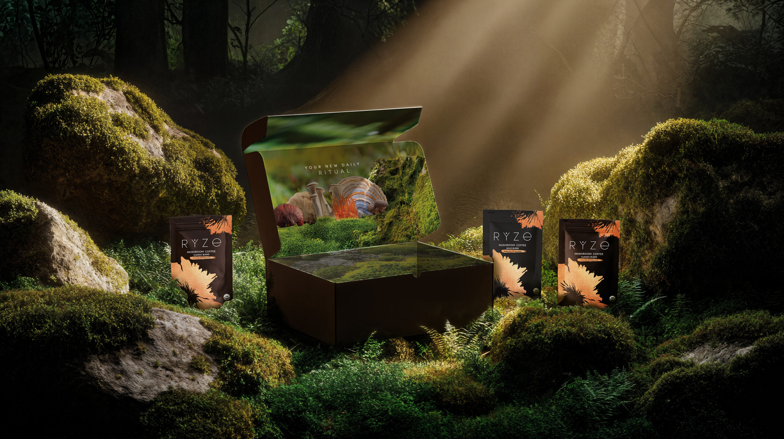
I designed the complete packaging system for RYZE SUPERFOODS, shaping the brand’s visual identity from the ground up. From structural concepts to graphic design, every detail was crafted to reflect RYZE’s core values — energy, balance, and modern wellness. The result is a cohesive and recognizable packaging line that stands out on the shelf and connects emotionally with its target audience.
Working closely with the RYZE SUPERFOODS team, I ensured that each packaging element was both visually striking and functionally sound. Sustainable materials, clean typography, and thoughtful color choices came together to support the brand’s mission and enhance the customer experience.
Ryze Limited Edition 2025
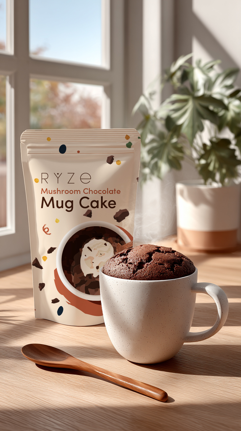
For 2025, Ryze introduces a series of limited-edition packaging designs celebrating the brand’s evolution and its community of modern creators.
Each design reimagines the core Ryze aesthetic — minimal, expressive, and nature-inspired — through bold textures, refined typography, and unexpected color pairings.


RYZE SUPERFOODS
Mushroom Coffee

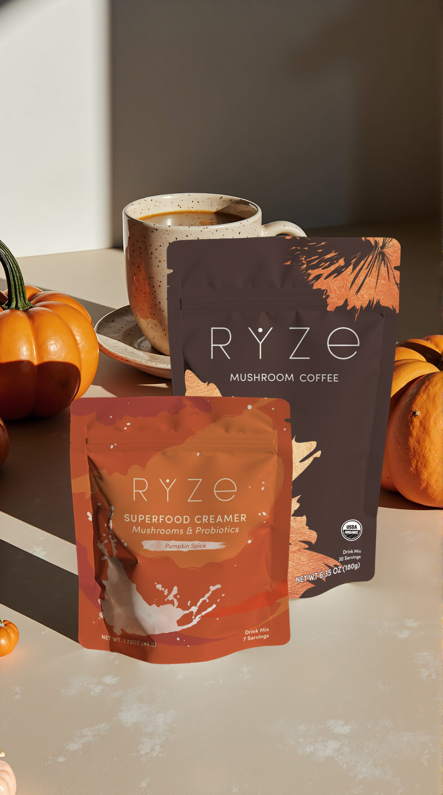
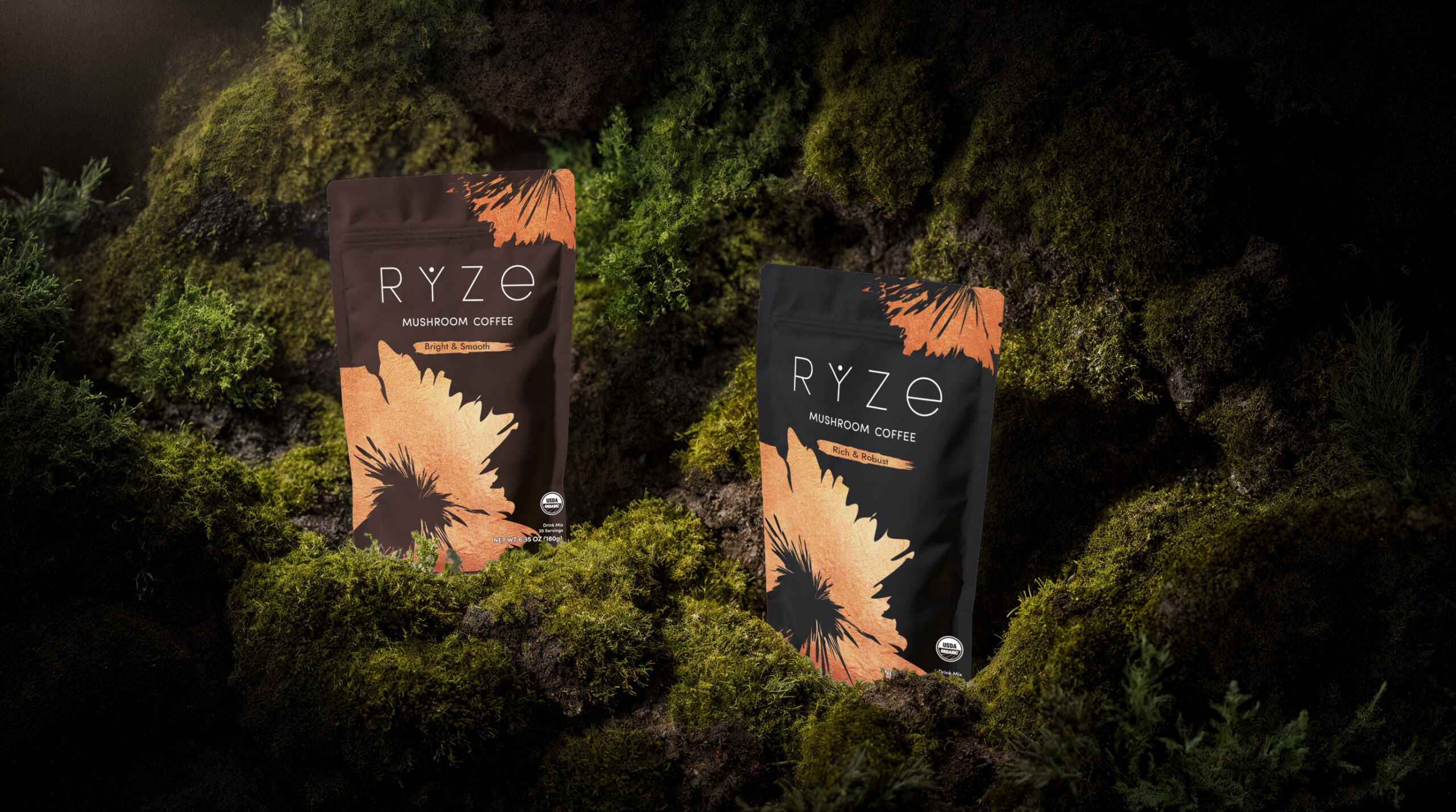
For RYZE SUPERFOODS flagship Mushroom Coffee, I designed packaging that balances functionality with a natural, grounded aesthetic.
The minimalistic design highlights the product’s wellness benefits while the earthy color palette and clean layout convey a sense of clarity and calm.
The resealable pouch not only preserves freshness but also reflects the brand’s commitment to sustainability.
The RYZE packaging now plays a key role in communicating the brand’s message and building trust with consumers.


RYZE SUPERFOODS Superfood Creamer
Ryze Superfood Creamer packaging complements the coffee while standing out with a lighter, warmer tone that emphasizes creaminess and indulgence.
I focused on visual harmony across the product line, while giving this variant its own unique character.
The matte finish and soft color palette reinforce the product’s plant-based, clean-label appeal.


RYZE SUPERFOODS
Mushroom Hot Cocoa
The RYZE Mushroom Hot Cocoa packaging was designed to visually embody the calming, sleep-enhancing qualities of the product.
With a deep navy blue background and a subtle illustration of the Milky Way, the design creates an immediate association with night, rest, and relaxation.
The celestial theme not only reinforces the product’s purpose as a bedtime drink but also adds a dreamy, immersive quality that draws the eye and evokes a sense of calm.
The overall look is minimal yet atmospheric, allowing the natural and organic benefits of the cacao to take center stage.
Paired with gentle typography and clean layout, the design communicates trust, purity, and serenity — aligning perfectly with RYZE’s promise of helping users fall asleep, stay asleep, and wake up refreshed.

RYZE Mushroom Chai
The RYZE Mushroom Chai packaging is a warm, inviting expression of the product’s energizing and nourishing qualities.
Using an abstract blend of earthy tones — inspired by Ayurvedic spices — the design visually conveys warmth, comfort, and vitality.
The flowing, organic shapes suggest movement and balance, echoing the natural energy boost and focus the chai provides.
This visually rich packaging stands out while remaining harmonious with the rest of the RYZE product line.
The warm color palette and textured aesthetic make the product feel grounding yet uplifting, aligning with its adaptogenic benefits.
It’s a modern take on a traditional ritual — vibrant, comforting, and deeply connected to wellness.

RYZE Mushroom Gummies
Mushroom Multi Gummies
The packaging for RYZE Mushroom Multi Gummies captures the essence of a fresh start and daily vitality.
Featuring a soft sunrise and warm morning hues, the design immediately evokes a sense of energy, optimism, and clarity.
The rising sun motif symbolizes the product’s purpose — to fuel your day with steady focus, immune support, and adaptogenic strength.
The vibrant yet gentle color palette makes the packaging approachable and uplifting, aligning perfectly with the product’s all-day wellness support.
Mushroom Sleep Gummies
For the Mushroom Sleep Gummies, the packaging takes a serene, dreamy turn.
A tranquil night sky with a glowing moon sets the mood, visually reinforcing the product’s promise of restful, restorative sleep.
Cool, deep tones like midnight blue and soft purples create a soothing aesthetic, while subtle, starry accents suggest calm and relaxation.
The visual language is both peaceful and inviting, making the product feel like a trusted companion in your nighttime routine.

RYZE Mushroom Matcha
The Matcha packaging brings a fresh and vibrant energy to the RYZE lineup. I used soft green hues and clean visual elements to communicate clarity, focus, and vitality.
The minimalist layout reflects the purity of the ingredients and positions the product as a modern wellness staple for mindful consumers.


