CASE STUDY
Every project begins
with a brief
—
an idea, a vision, or sometimes just a few guiding words.
Each step adds structure and clarity, transforming abstract goals into tangible design. This case study documents how ThryvWell became a consistent, premium wellness brand.

Client’s words:
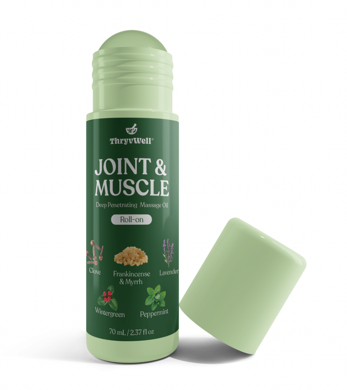
“Hi Inga, I had someone design packaging. But I am not 100% satisfied with it. I want to discuss that and see if you can make it better. Honestly — I am not sure what I will like — I just want it to look premium. This is what I have right now.
HOW CAN YOU MAKE THIS BETTER?”
I explained to client that before starting design work, we needed to establish a Clear Brief.
Logo and packaging are two different creative processes, and to achieve a premium result, we had to move step by step.
Logo → Brand Identity → Packaging
I asked targeted questions to uncover his expectations, references, and brand values:
General Brand Information → mission, uniqueness, emotions.
Audience → who they are, what matters to them.
Associations & Meaning → keywords, metaphors, and what to avoid.
Visual Style → admired brands, design preferences, colors, typography.
Logo Versions & Usage → where the logo would appear and how flexible it should be.
Long-Term Vision → how the brand should evolve in 5–10 years.
Finally, I emphasized the importance of putting this in writing — because a written brief reveals priorities more clearly than spoken words.
Brand Discovery Checklist
Every strong brand begins with clarity. My checklist turns scattered ideas into a clear creative direction, transforming “I want it to look premium” into a design system with purpose and personality.
General Brand Information
-
Mission in one sentence
-
What makes the brand unique
-
Emotions the logo should evoke
Audience
-
Who is the primary target
-
Cultural or emotional considerations
Associations & Meaning
-
Keywords to represent visually
-
Symbols or elements to avoid
Visual Style
-
Brands you admire and why
-
Preferred design style (refined, minimalist, expressive)
-
Preferred color palette
-
Typography preferences
Logo Versions & Usage
-
Main logo (icon + brand name)
-
Monogram / Symbol only
-
Logotype (text only)
-
Where the logo will be used (web, social, merchandise, etc.)
Long-Term Vision
-
Future product/service expansion
-
Desired image in 5–10 years
This structured approach set the foundation for a design process aligned with the client’s vision and helped move from uncertainty (“I just want it to look premium”) to clarity and direction.
STAGE 01
Stage 1
Brief & Discovery
The project began with a simple request: “I just want it to look premium. How can you make this better?”
Through my structured discovery process, that uncertainty was transformed into a clear, detailed brief.
Together with the client, we defined:
Brand essence:
ThryvWell™ is a wellness brand rooted in Ayurvedic tradition, offering clean, plant-based, and sustainable products
Core values:
Purity and transparency, balance, holistic vitality, trust, and sustainability.
First product:
An Ayurvedic joint & muscle massage oil, to be followed by supplements, probiotics, and natural sunscreen.
Logo objectives:
Minimal, expressive, natural, and warm — avoiding any medical connotations. Flexible across products and platforms, aligned with an earthy color palette (#B1E2A1)
Preferred style:
Elegant minimalism with a human touch, sans-serif typography, and scalable logo versions (full, wordmark, symbol).
This discovery phase not only clarified what the brand should look and feel like but also set up a step-by-step workflow with clear phases — from concept exploration, to refinements, to final identity delivery.
STAGE 02
Stage 2
Concept Development :
Mood
From Mood to Brand
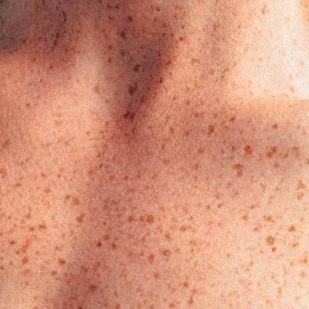
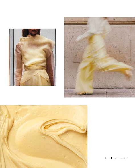
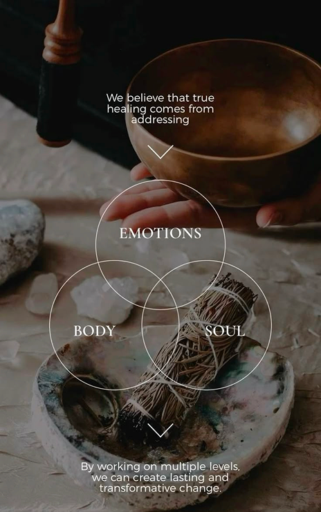
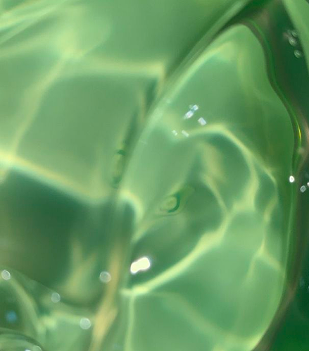
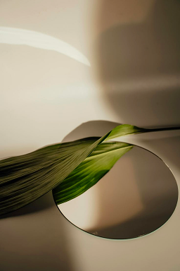
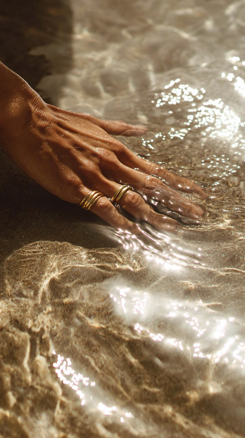
Once the brief was defined, the next step was to capture the right mood and visual language.
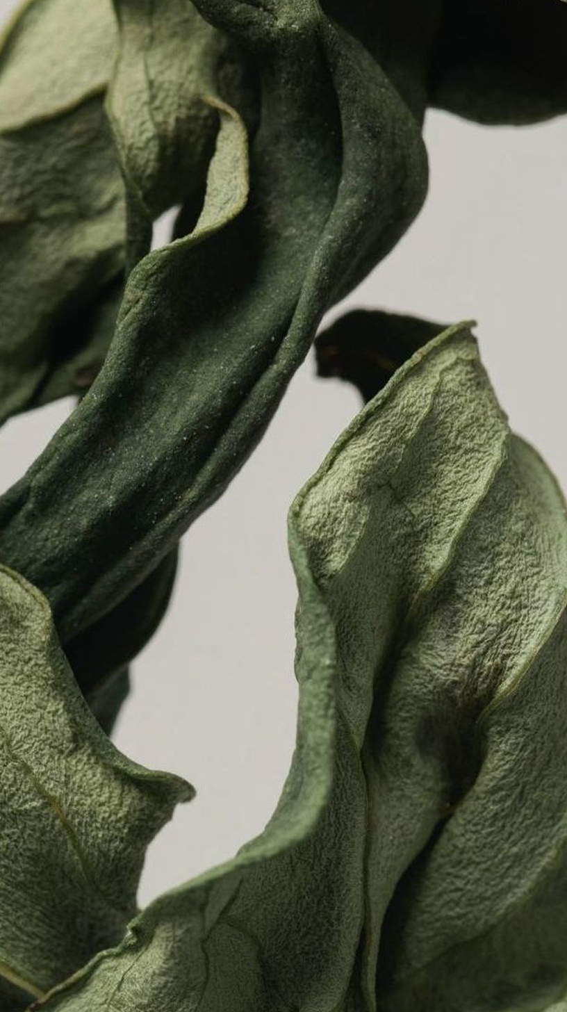
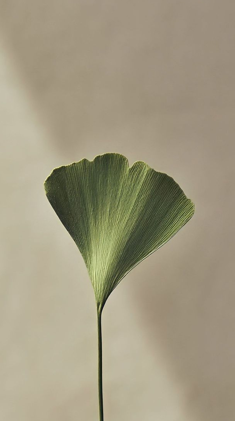
I created moodboards exploring different directions — from natural minimalism to balanced vitality — using color palettes, textures, and typography as visual anchors.




STAGE 03
Stage 3
Presentation
From Concepts to Experience
After shaping three distinct directions, I built a structured presentation to guide the client through each option. Instead of isolated logos, I showed how every concept behaved in the real world — on packaging, labels, social media, and digital touchpoints.
I don’t show logos on a white page. I show brands in action — because packaging and identity live in the real world.
STAGE 04
Stage 4
Client’s Choice &
Refinement
From Options to One Clear Direction
After reviewing the three concepts, the client gravitated toward the Clean Vitality + Flow direction. This option best reflected ThryvWell’s mission: natural, trustworthy, and premium, without feeling clinical.
LOGO
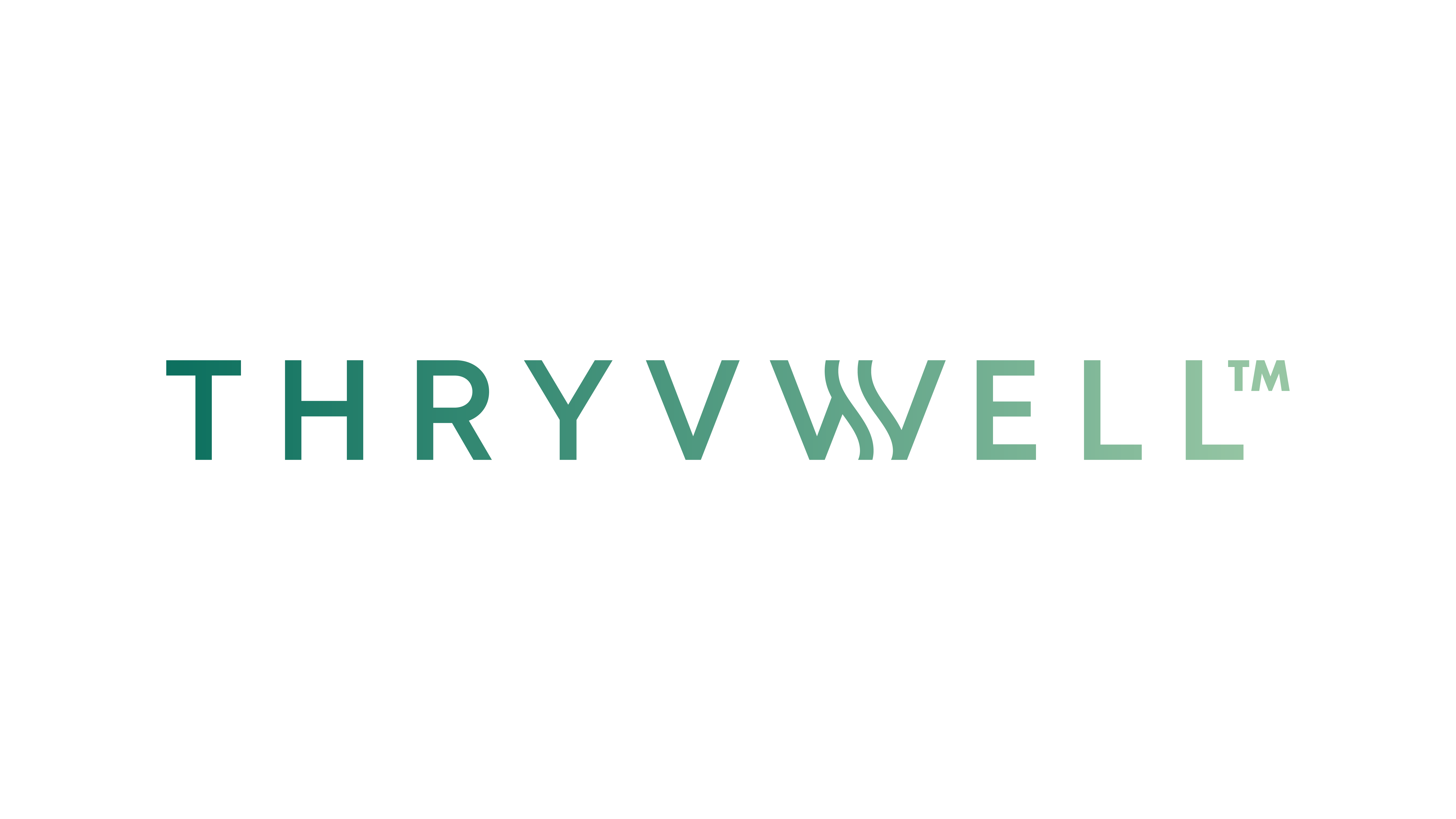
Why this route was chosen:
Calm minimalism → conveyed purity and balance.
Subtle flow lines → suggested energy and natural healing.
Scalable system → worked equally well for packaging, Amazon thumbnails, and future product extensions.
ICON
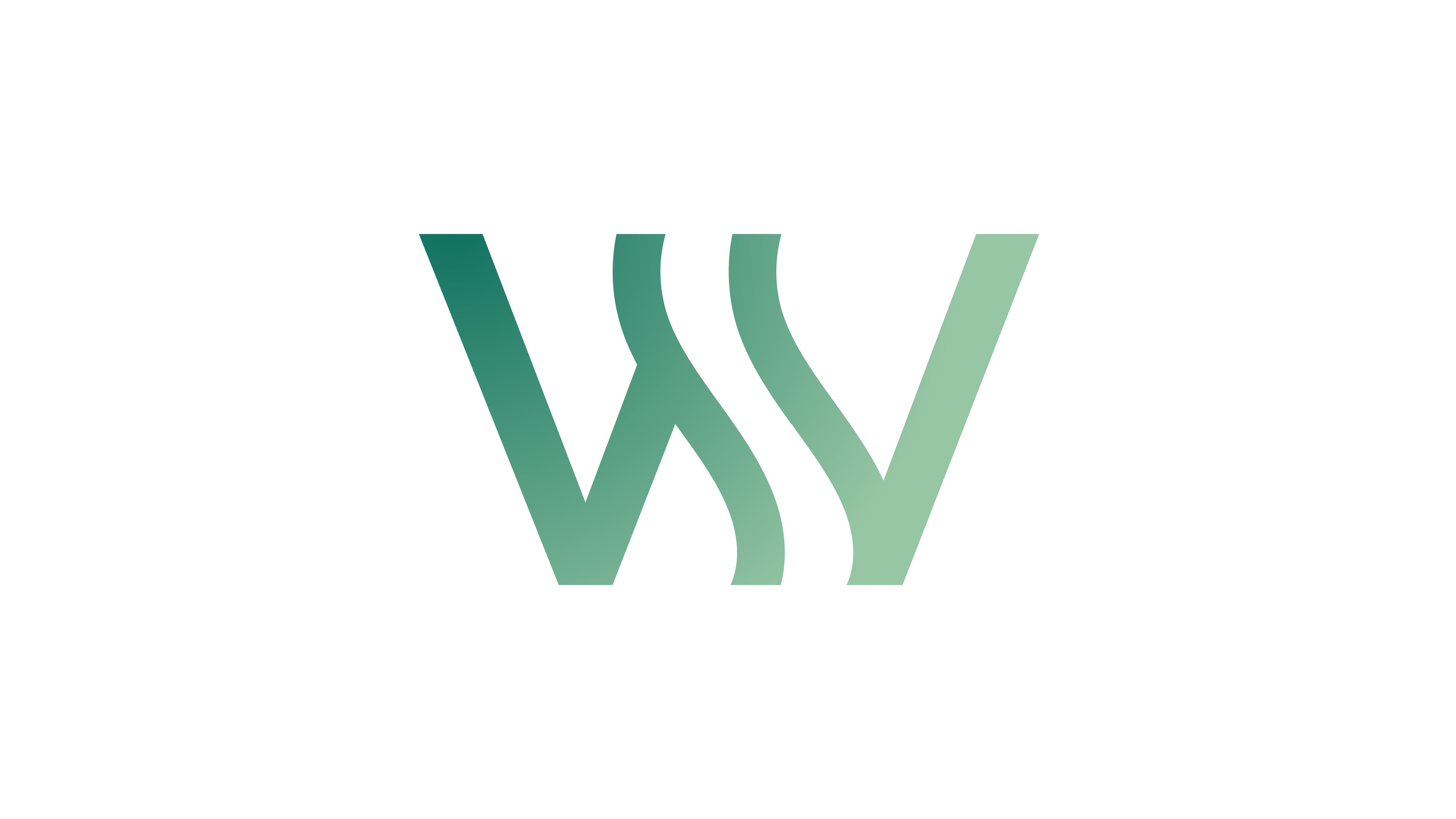
I refined the chosen concept by:
Adjusting typography hierarchy for legibility across print and digital.
Fine-tuning color contrasts to stay accessible and fresh.
Creating a unified logo system (icon + wordmark, symbol, text-only).
Preparing production-ready dielines and usage guidelines.
STAGE 05
Stage 5
Final Outcome
From Vision to Reality
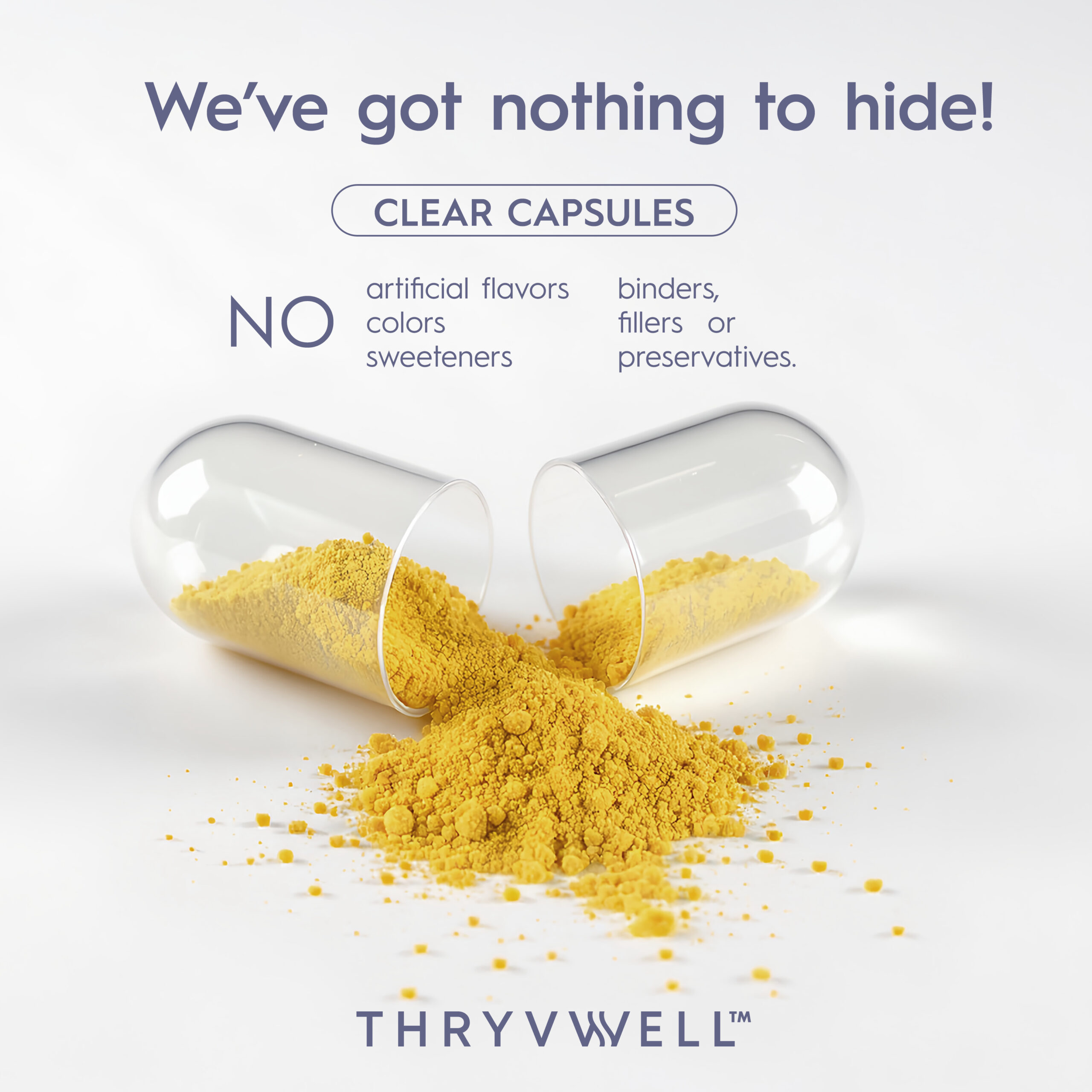
The final result is a consistent, premium wellness brand identity that translates seamlessly across products and channels.
ThryvWell now has:

A refined logo system — flexible for packaging, digital, and merchandise.


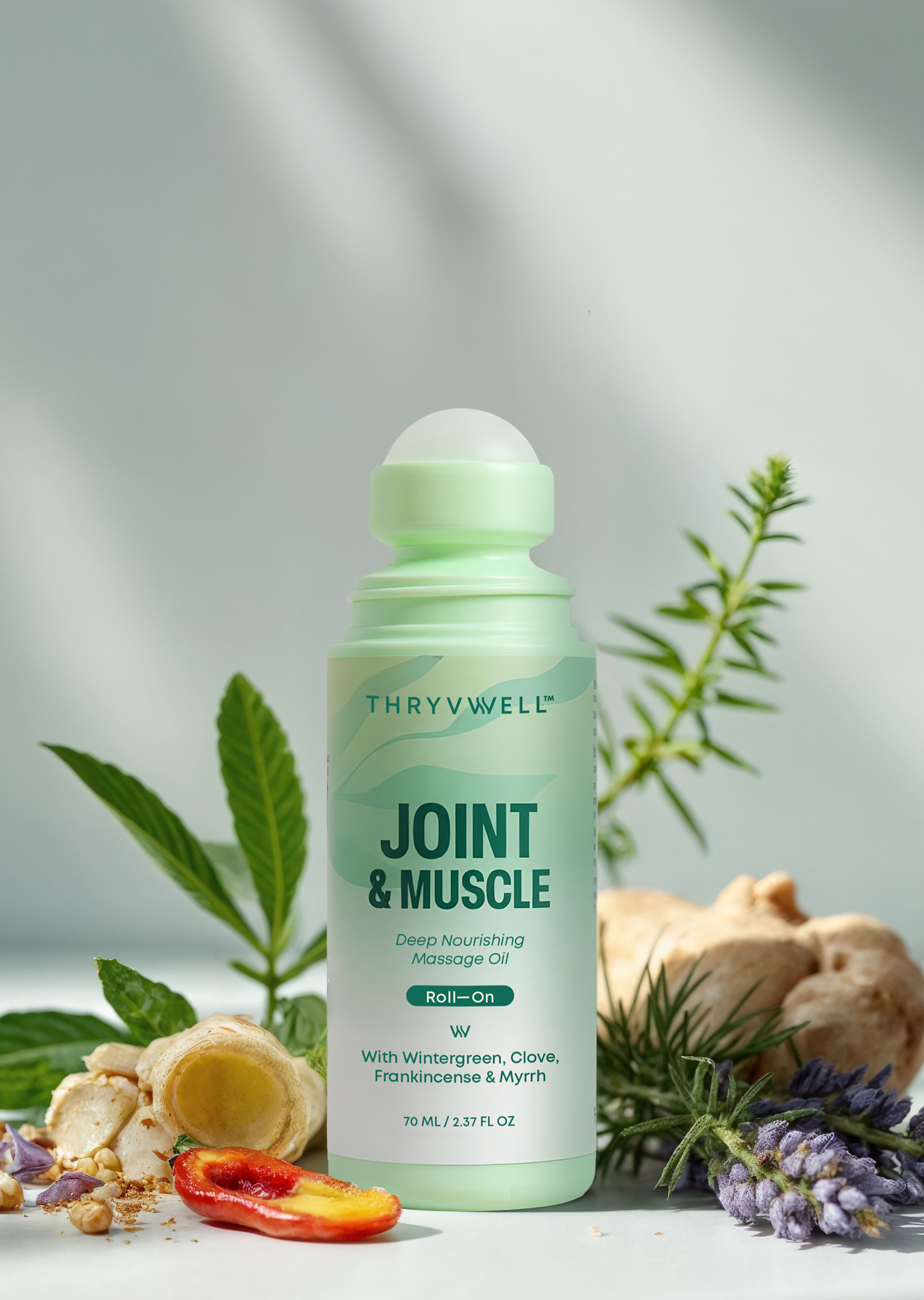
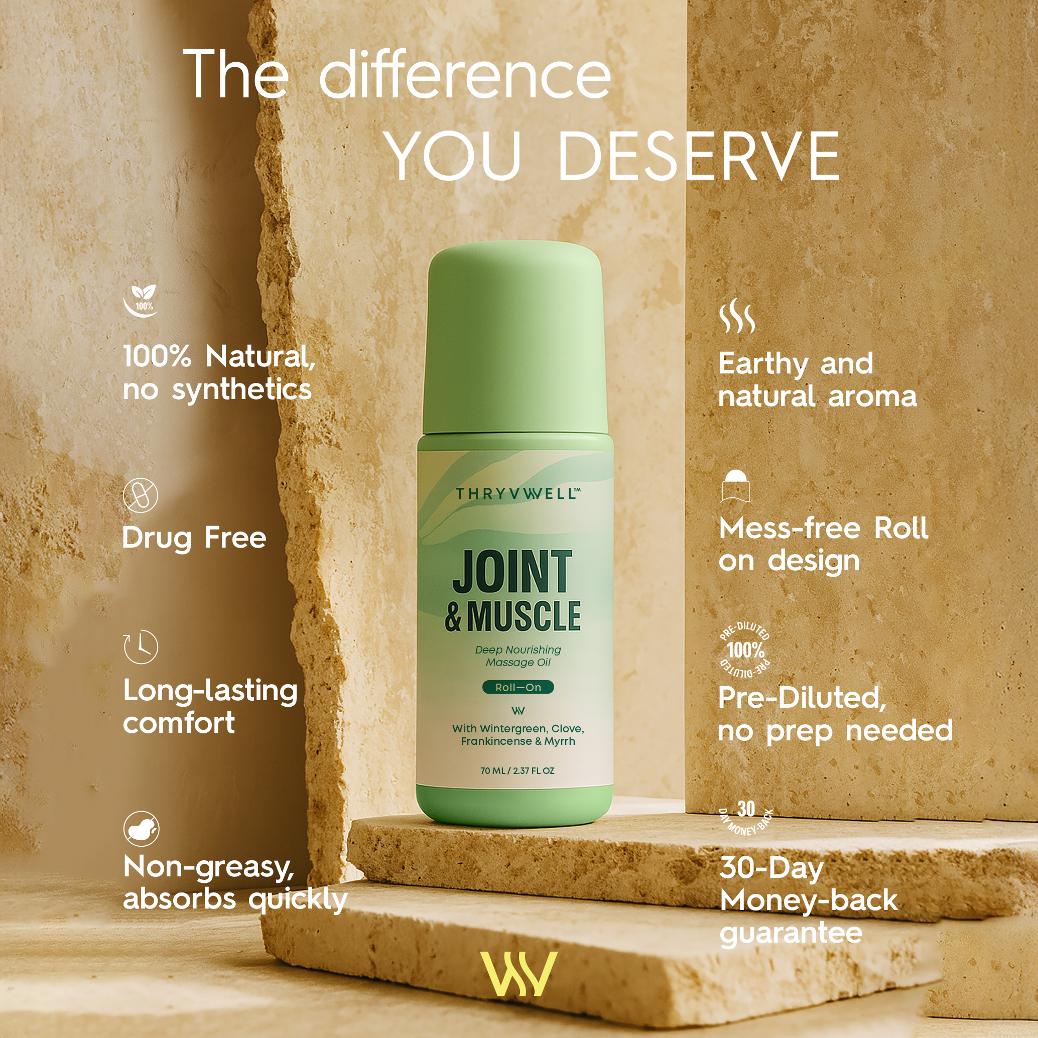
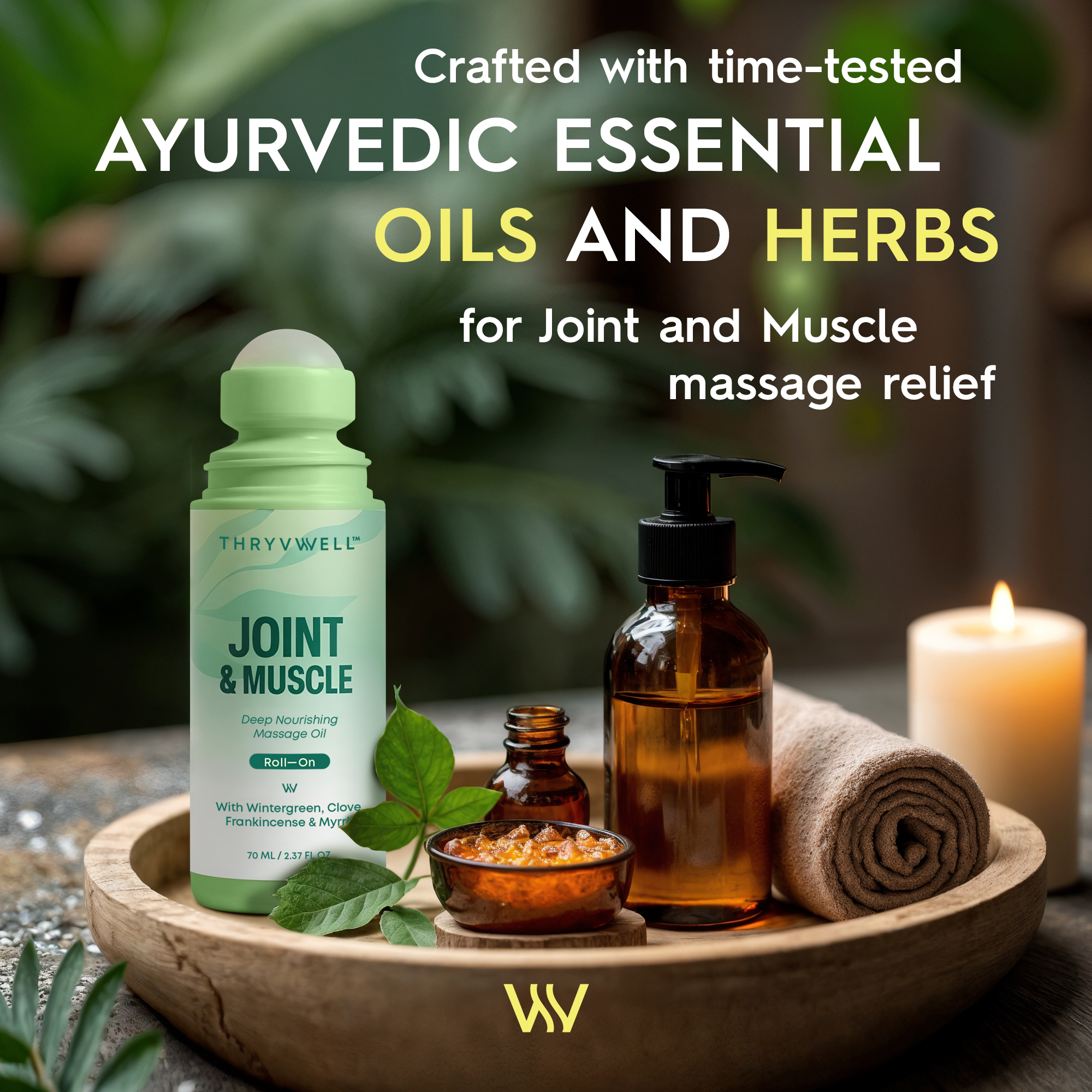
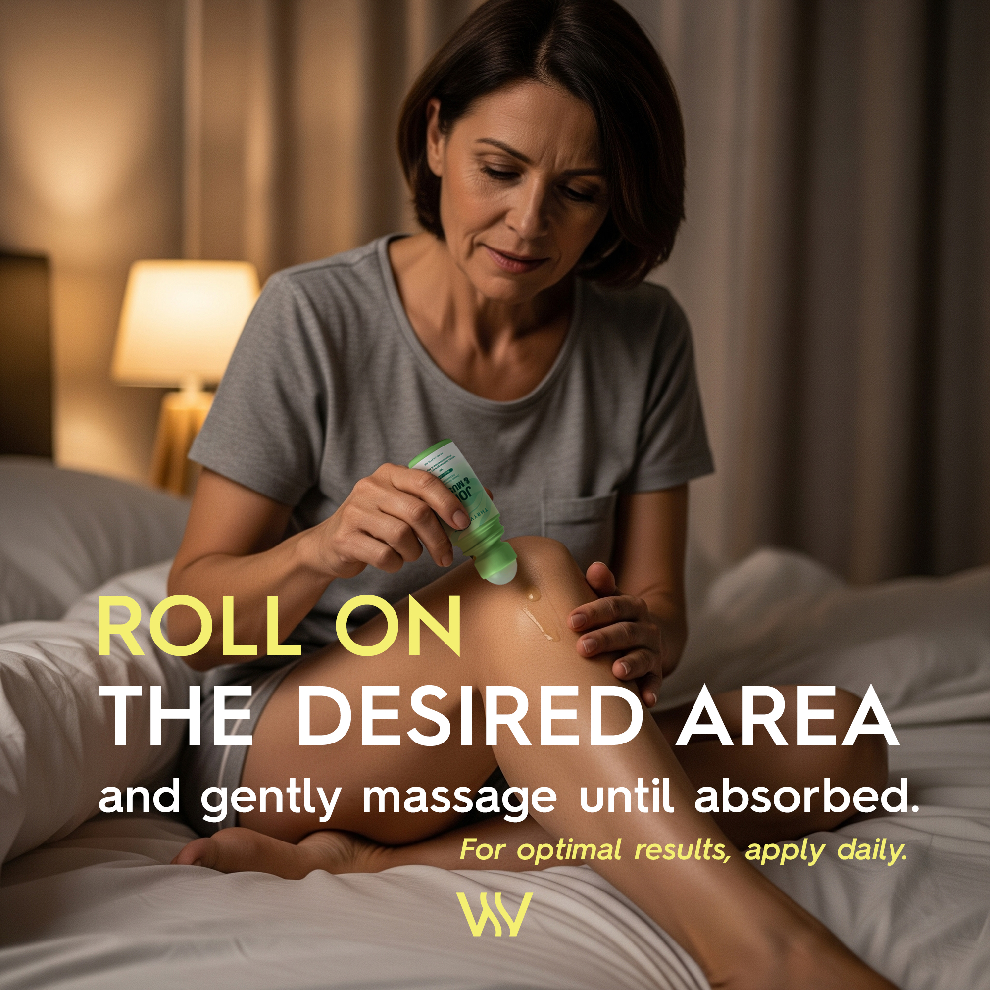
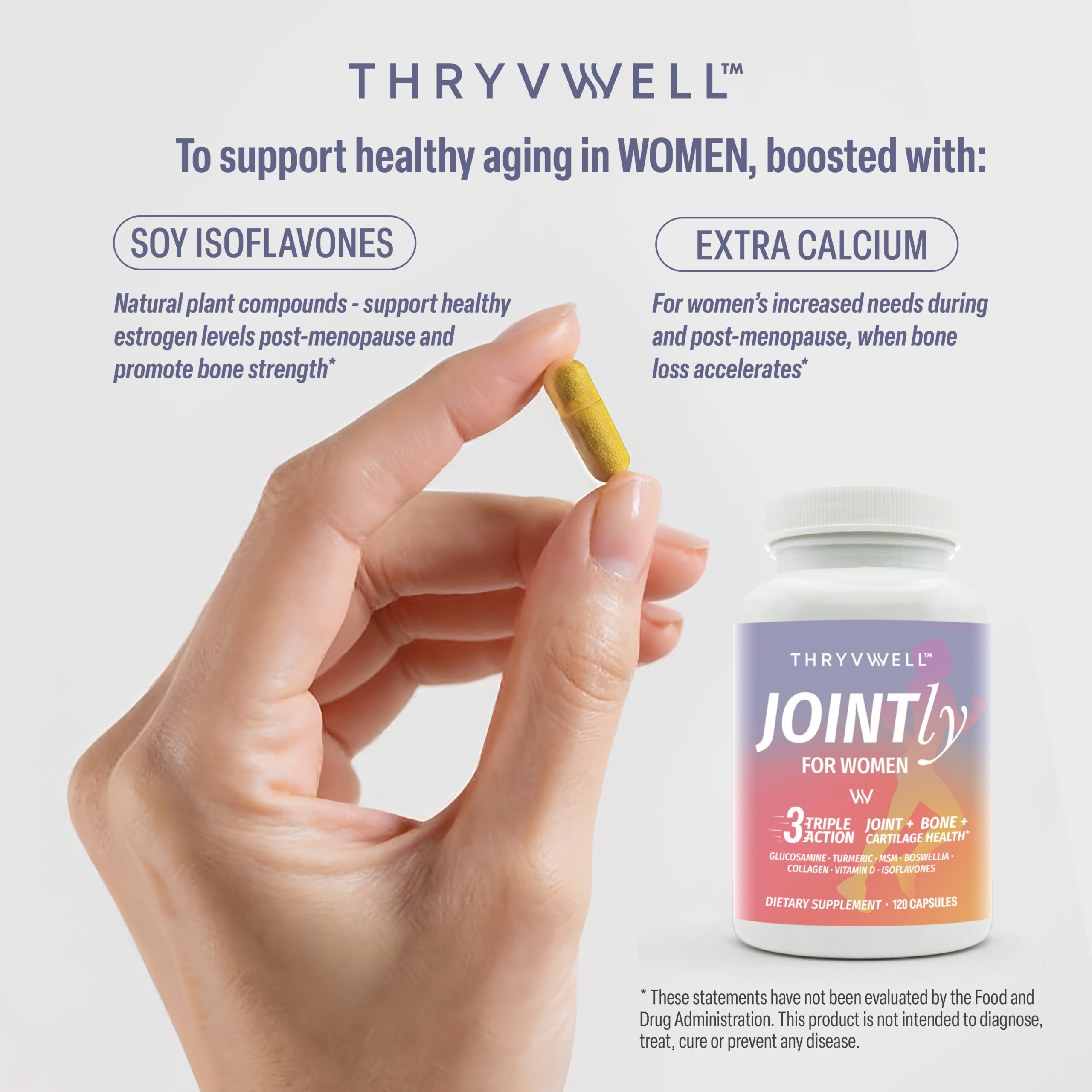
A cohesive packaging line — Joint & Muscle Roll-On and Jointly supplements (Women & Men), each distinct yet connected through one brand voice.
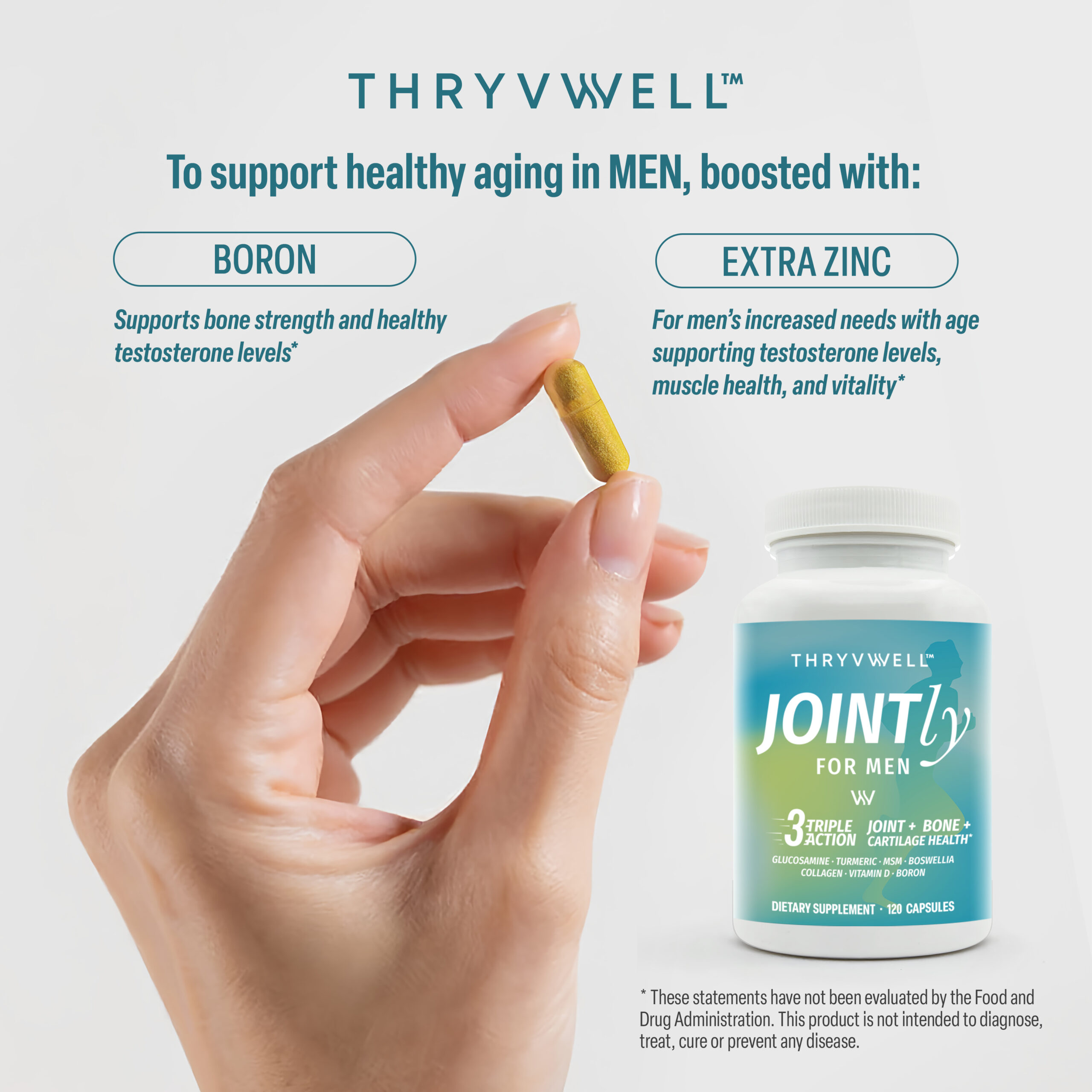
A scalable design system — ready to grow into new categories like probiotics and sunscreen.
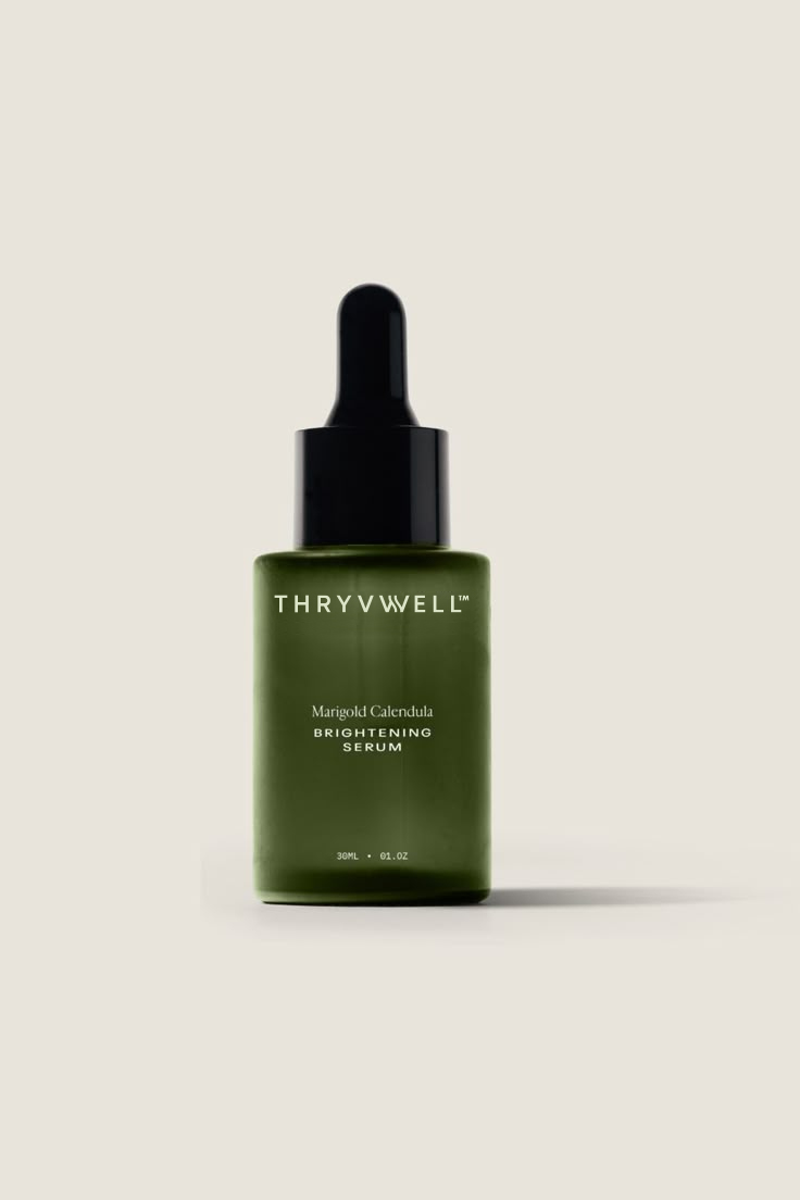
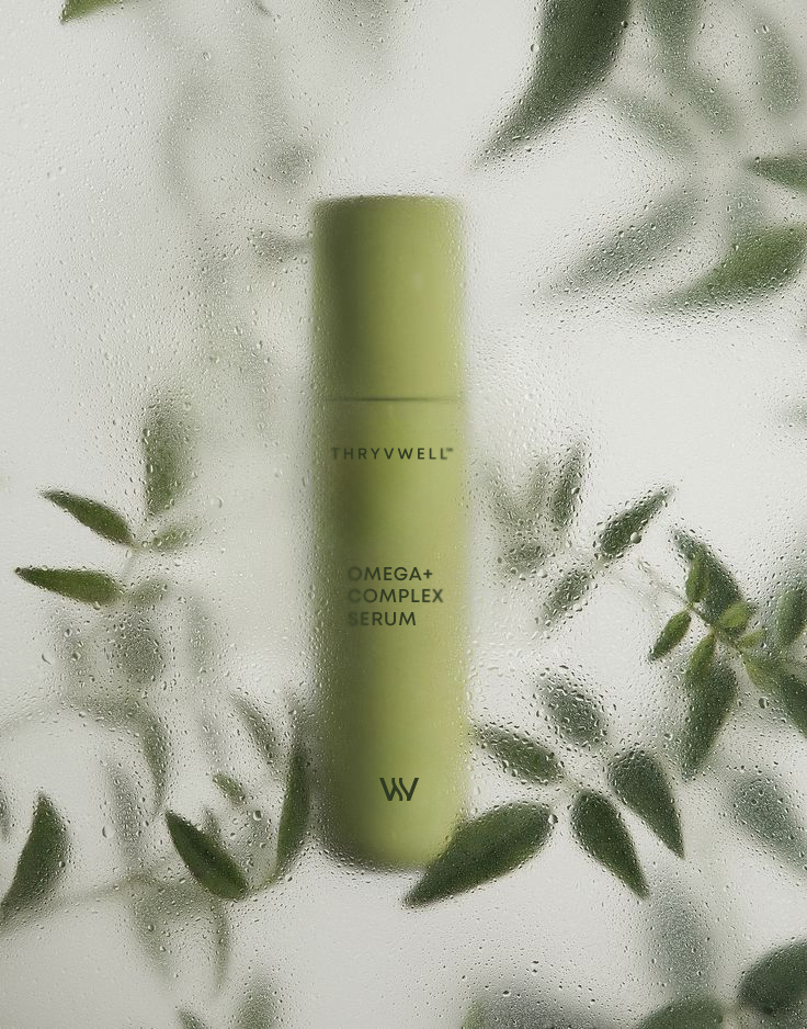
Optimized visuals for Amazon and e-commerce — clear, trustworthy, and impactful even at thumbnail size.

This transformation turned an uncertain start
(“I just want it to look premium”)
into a fully realized brand world — one that communicates purity, balance, and vitality, while standing strong in a competitive wellness market.
“From Brief to Brand — ThryvWell
now thrives inside and out.”
Project Summary
With ThryvWell, the journey went from uncertainty to clarity, from brief to brand.
What started as “I just want it to look premium” became a cohesive identity system and packaging line, ready to grow across multiple wellness categories.
The result: a brand that communicates purity, balance, and vitality, while standing out in both retail and digital spaces.
Are you ready to take your brand from idea to reality?
Let’s create an identity that not only looks beautiful, but also thrives in the market.
