
Cosmetics — Case 02
Identity & Packaging
Biyó
Holistic beauty, distilled — an organic skincare house built on nature, science and restraint.
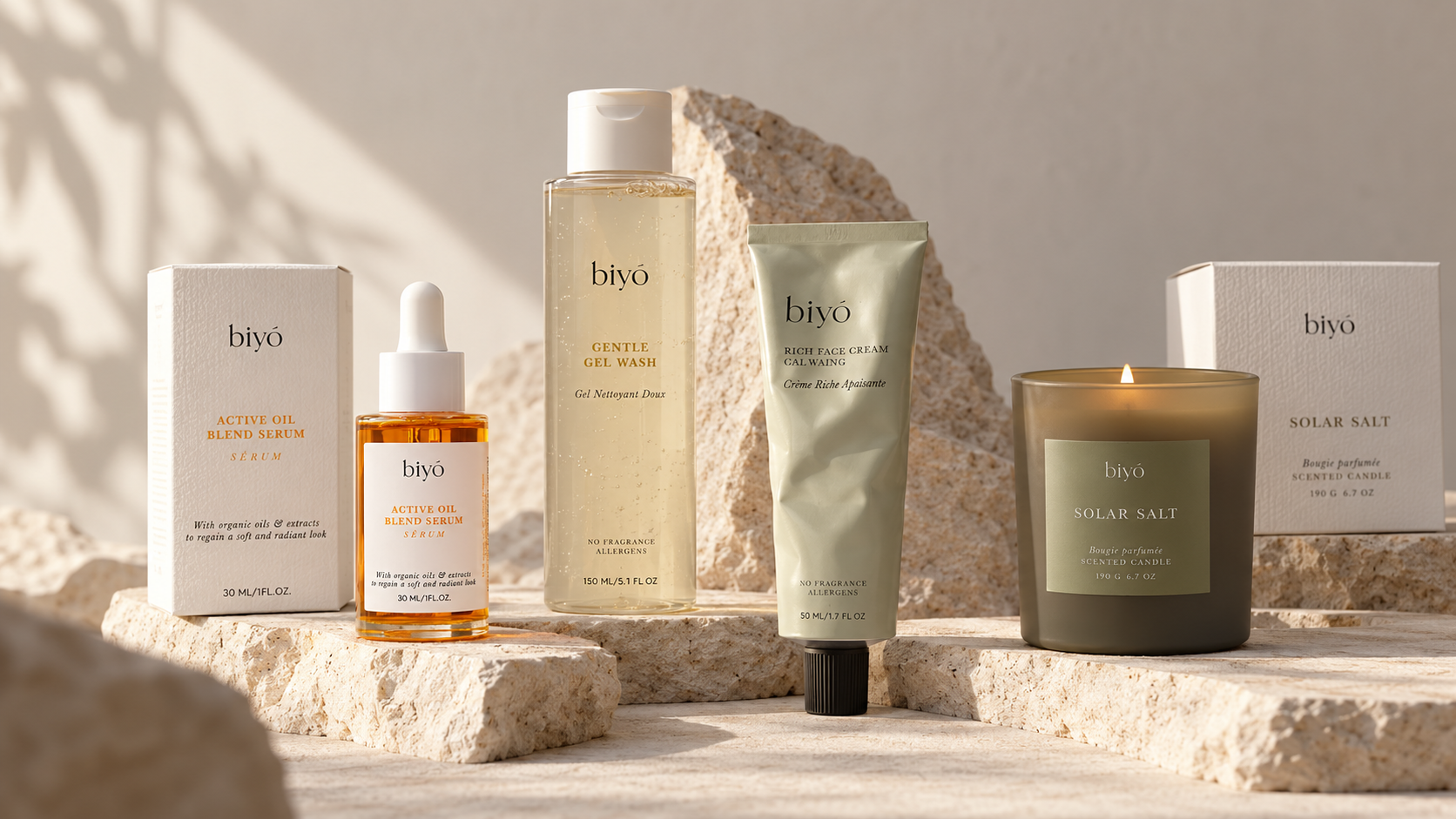
Pl. 01 — The core range
Client
Sector
Scope
Year
01 — The brand
i.
Purity
Formulas and forms reduced to what is essential — nothing ornamental, nothing hidden.
ii.
Trust
Transparent information on every pack: what is inside, and why.
iii.
Balance
Where nature meets science, and where luxury still feels approachable.

Pl. 02 — Сleanser
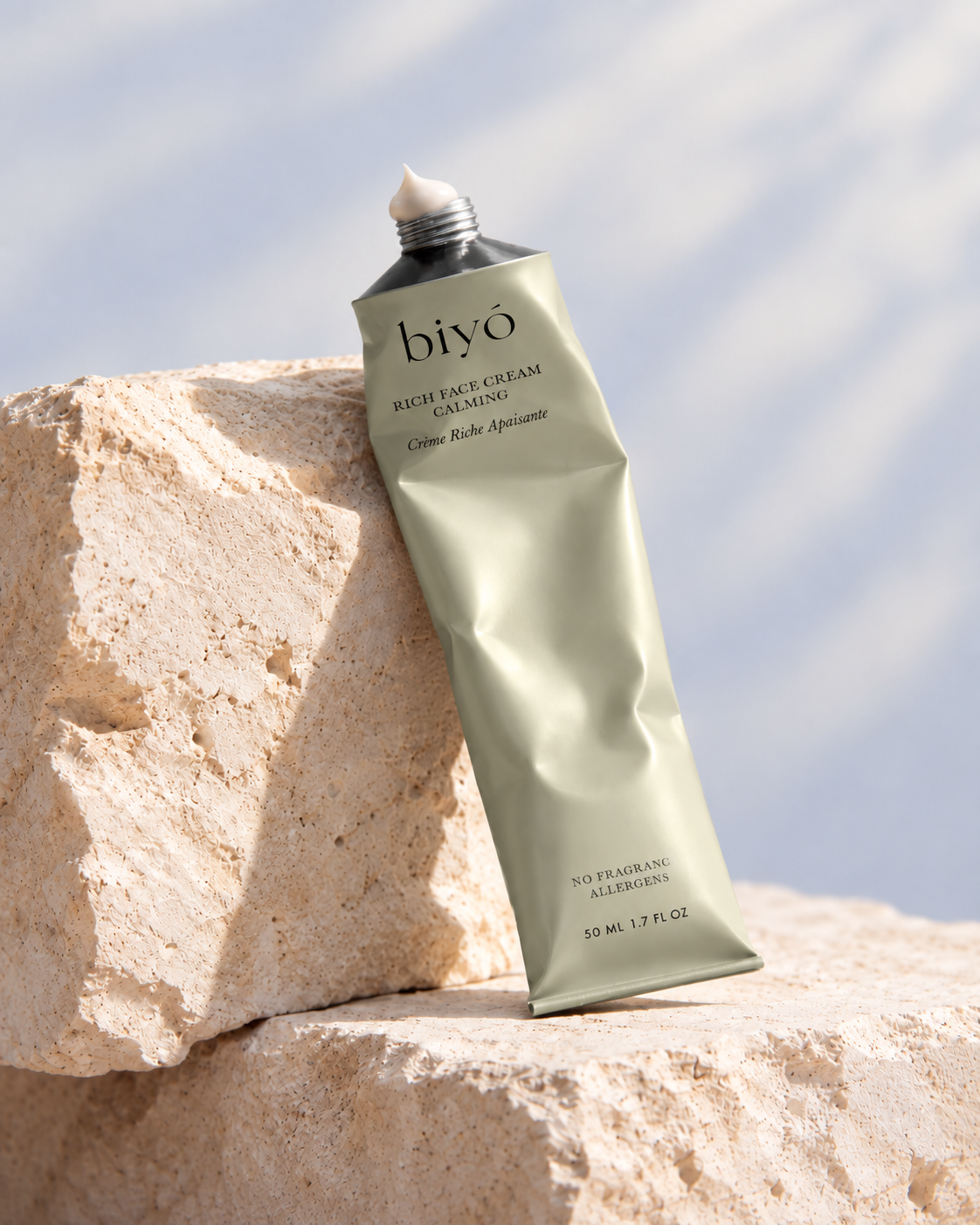
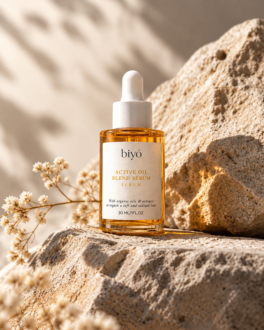
Pl. 03 — Serum
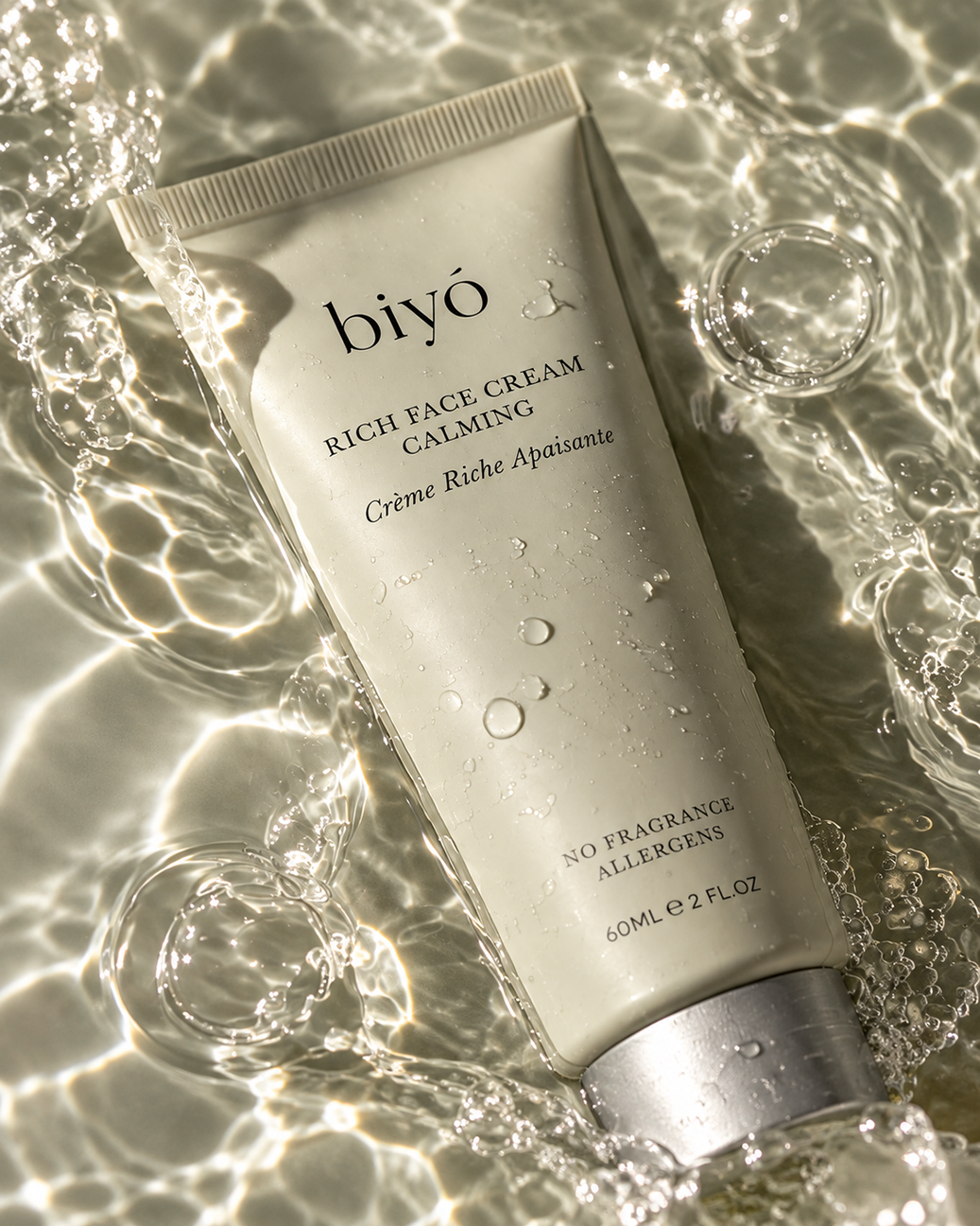
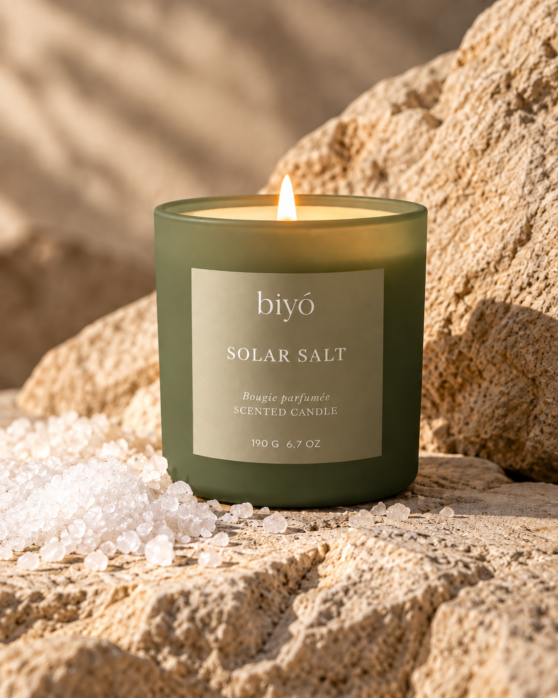
Each SKU keeps the same quiet frame — wordmark, a single typographic hierarchy, generous space — while its material and tone give it a voice of its own.
02 — Design concept
Less is more.
The identity translates Biyó’s philosophy directly into form: every element earns its place, and what remains is given room to breathe.
A — Logo

A minimal, elegant wordmark with a natural softness in its curves — evoking trust and authenticity.
B — Packaging
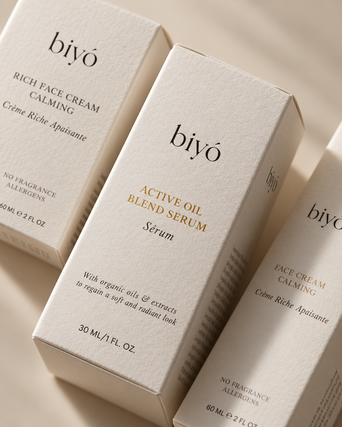
Clean layouts, soft earthy tones and refined typography speak to transparency and sustainability.
C — System
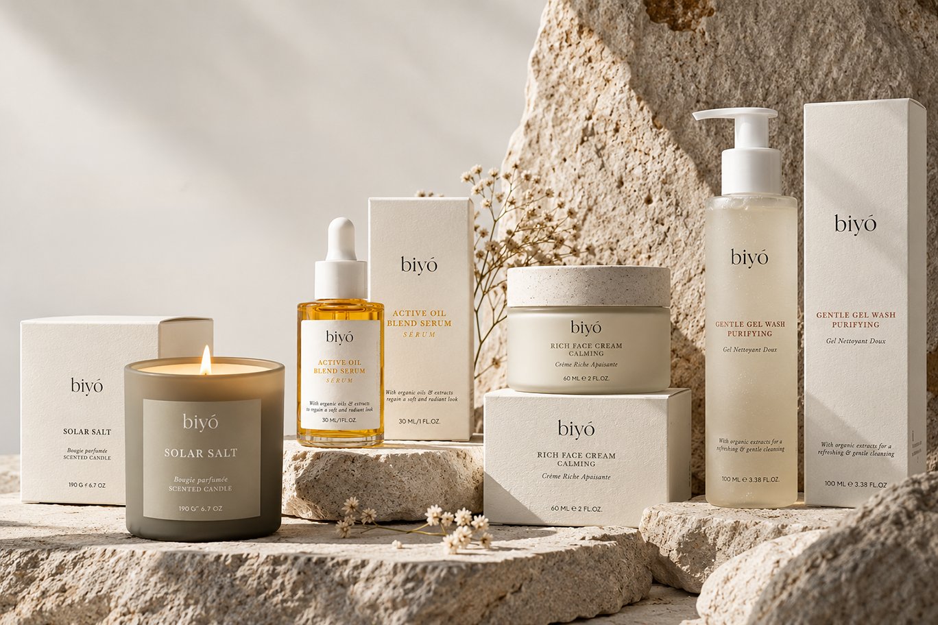
Built to scale across product lines — cohesive as a family, while each SKU keeps its own voice.
03 — Palette & typography
Earth, skin, botanical
Cream
#F3EFE7
Stone
#DCD2C3
Sage
#B9BDA6
Olive
#6E6D55
Bark
#24221E
Aa
Headings & titlesBaskerville
Paragraphs & small typeMontserrat
The promise
Clean & organic skincare.
100% recycled packaging.
04 — Outcome
A brand that communicates premium simplicity and organic integrity at every touchpoint.
Biyó now stands as a modern organic label that feels both luxurious and approachable — speaking to people who value sustainability, wellness and clarity of design.
Next case